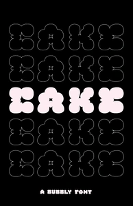
PROJECT: CAKE (2024)
TOOLS USED: Adobe Illustrator
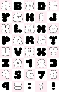
PROJ. OVERVIEW: Create a font to be used as the nameplate of a zine of your choosing. Develop a complete uppercase and lowercase character set along with numbers and symbols.
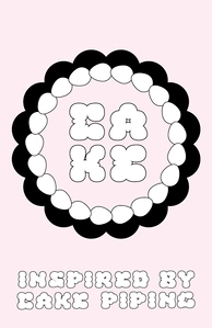
BACKGROUND: The zine I chose to create is called Bite. It is a bite-sized unconventional dessert themed zine that offers its readers a feast for the eyes. Featuring hyper feminine fashion, delicate recipes and all things sweet artistry, Bite embraces delicate femininity and is a celebration of indulgence.
PROCESS: With my unconventional, feminine, dessert-themed zine in mind, I first began by sketching to experiment with various concepts for the font. Ultimately, I felt that the strongest and most interesting concept was to create letterforms inspired by the texture of cake piping. Once this was decided, I developed a stroke family for the font and with that, began sketching out each character accordingly.
EXECUTION: Once I had all the characters drawn to my liking, with some more rough than others, I uploaded my sketches onto Adobe Illustrator which I then used to refine and render each character digitally, stroke by stroke. It was important to me that the font feel consistent as a unit but also maintain an organic and intentionally imperfect quality to mimic the handmade aspect of cake decorating.